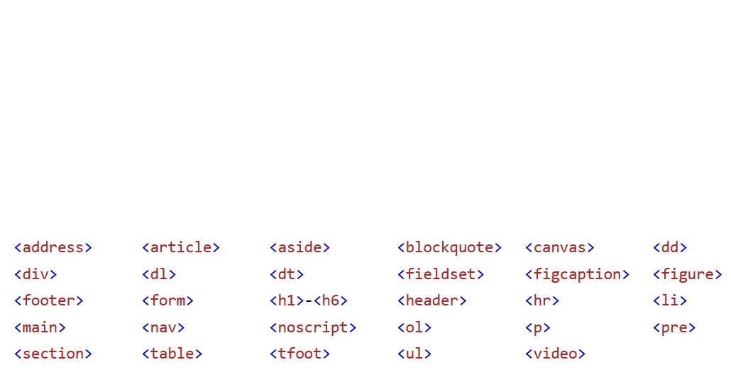
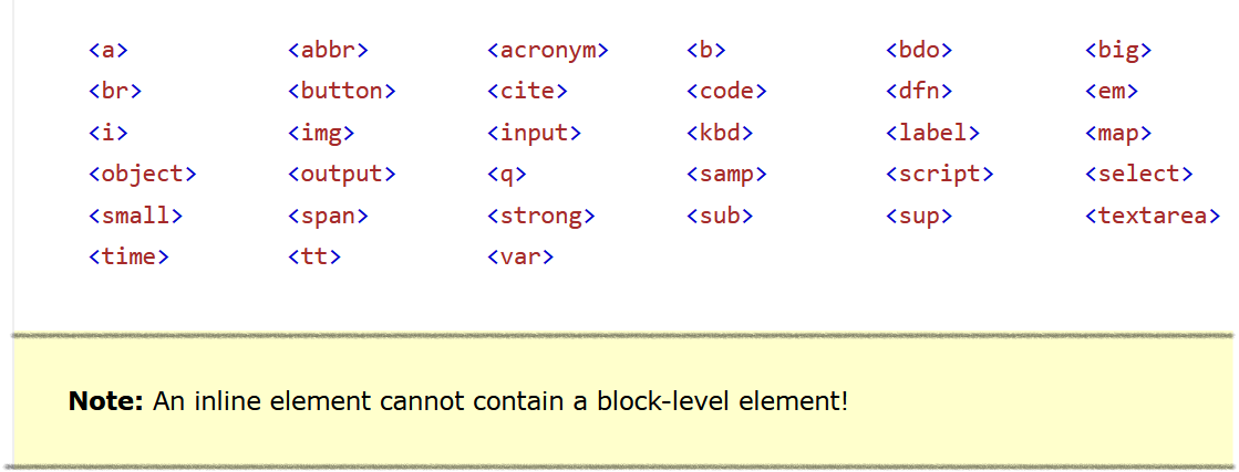
 CSS
What is CSS?
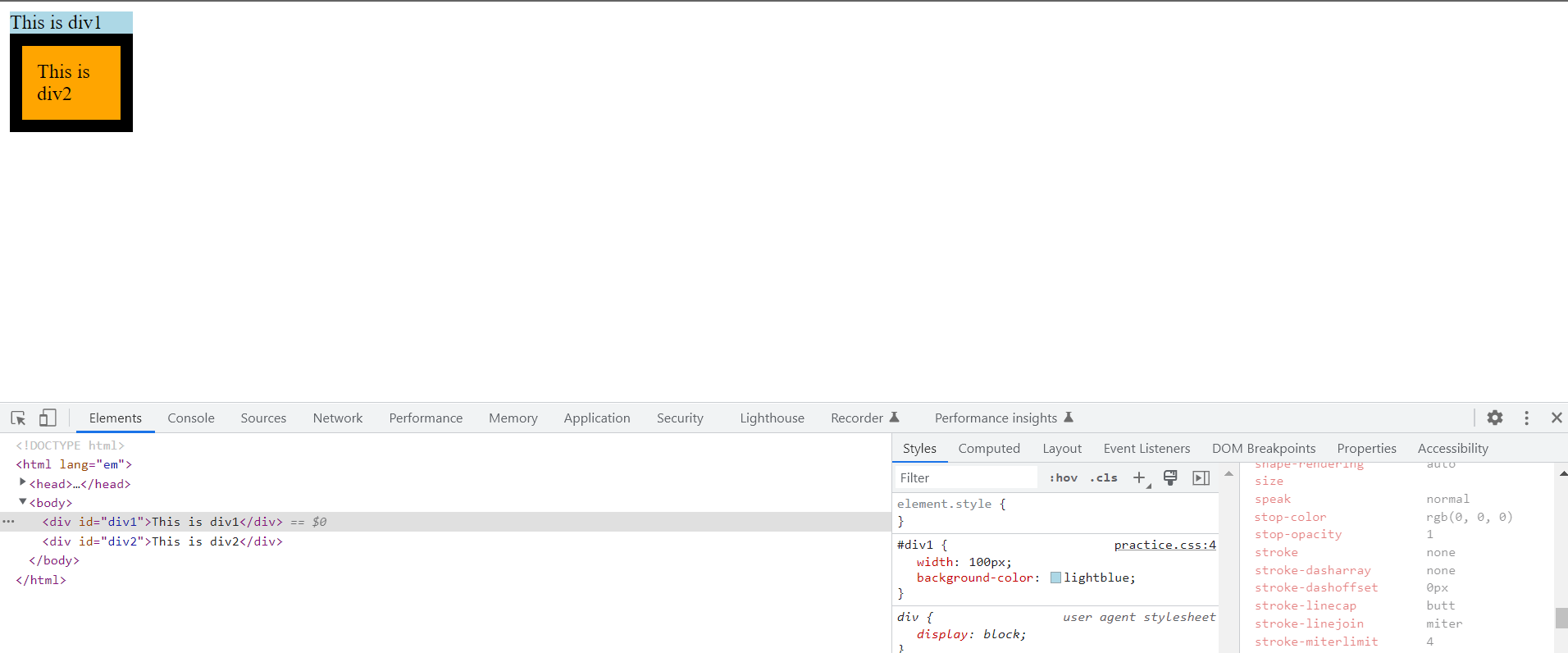
Selectors in CSS
Pseudo Classes
Pseudo Elements
Selector Specificity
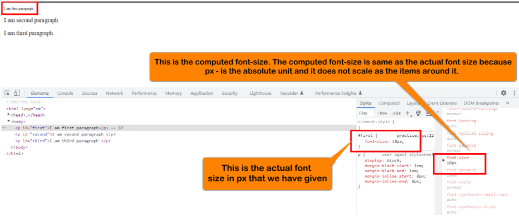
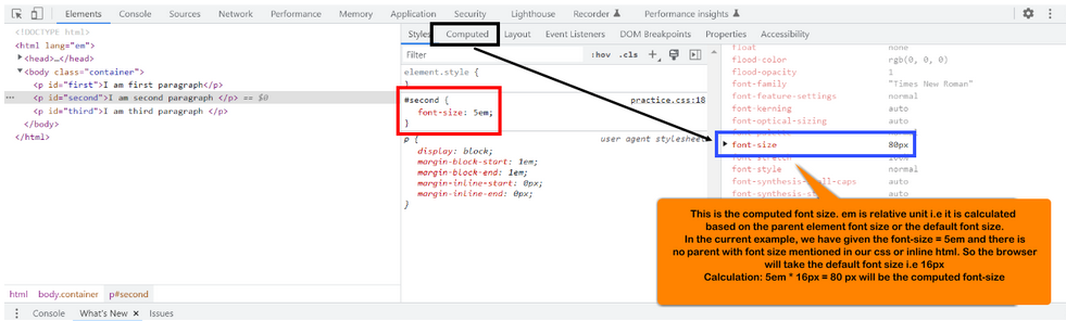
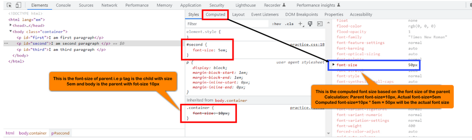
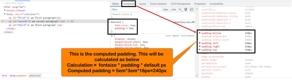
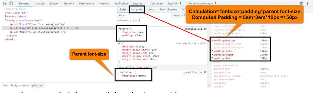
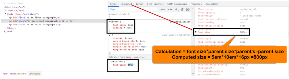
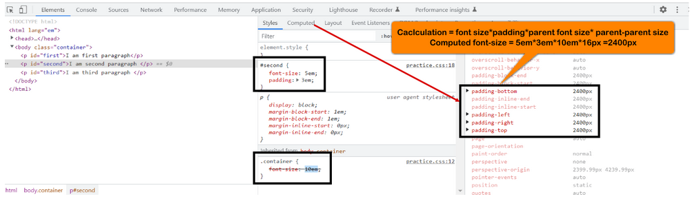
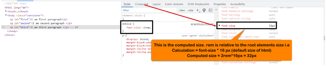
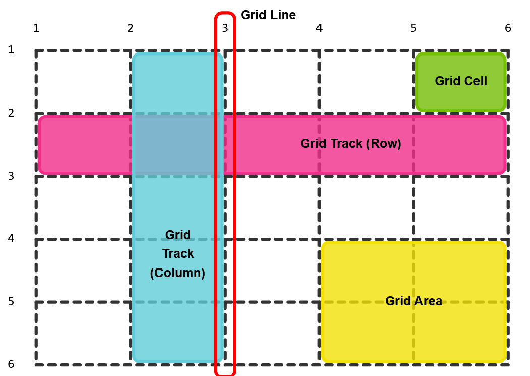
CSS Units
CSS colors:
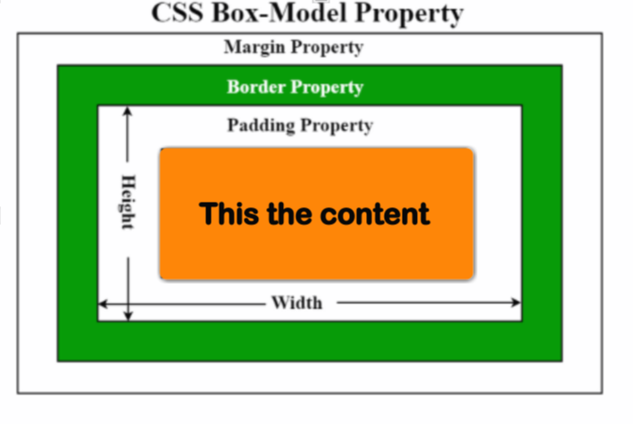
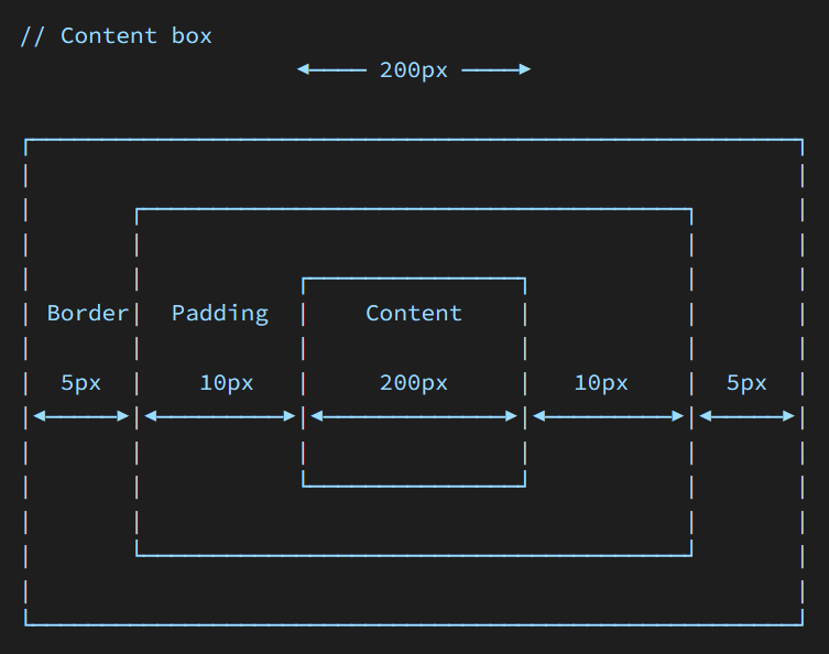
Box Model
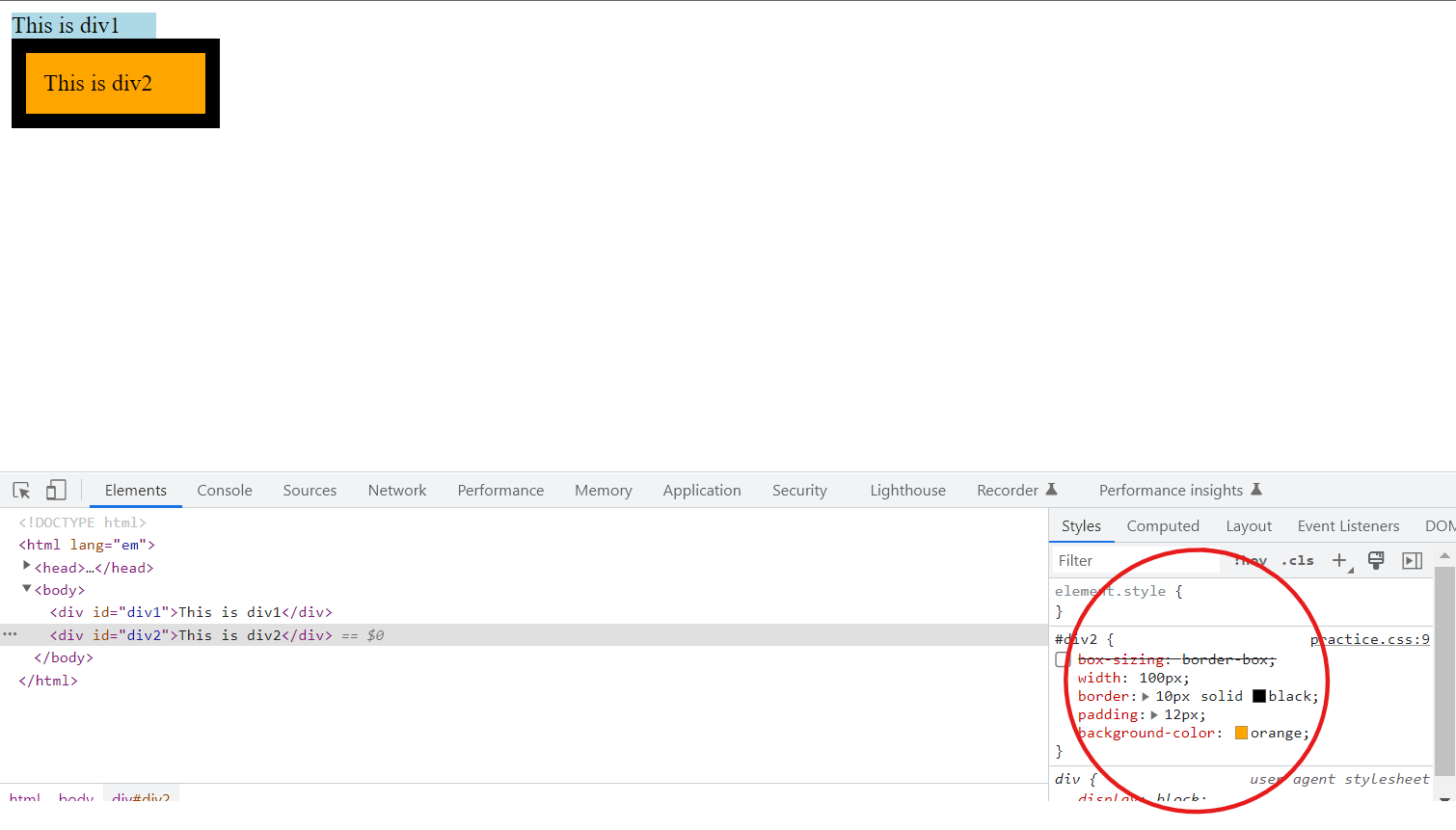
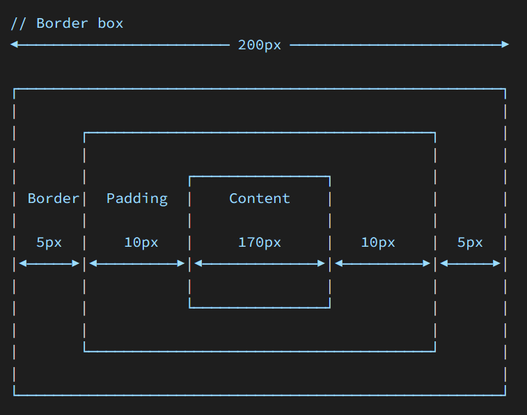
Box Sizing
Position Property
Stacking Context
CSS
What is CSS?
Selectors in CSS
Pseudo Classes
Pseudo Elements
Selector Specificity
CSS Units
CSS colors:
Box Model
Box Sizing
Position Property
Stacking Context
CSS
What is CSS?
Selectors in CSS
Pseudo Classes
Pseudo Elements
Selector Specificity
CSS Units
CSS colors:
Box Model
Box Sizing
Position Property
Stacking Context
CSS
What is CSS?
Selectors in CSS
Pseudo Classes
Pseudo Elements
Selector Specificity
CSS Units
CSS colors:
Box Model
Box Sizing
Position Property
Stacking Context
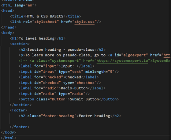
<!DOCTYPE html>
<html>
<head>
<title>HTML & CSS BASICS</title>
<link>rel="stylesheet" href="style.css"/>
</head>
<body>
<h1>Hello World</h1>
<p>I am a Web Developer</p>
</body>
</html>
.flex-container {
text-align: center;
color: blue;
font-weight: normal;
text-decoration: underline;
}
.flex-container {
background-color: blue;
color: white;
height: 100px;
font-size: 1.25rem;
}


.flex-container
{
display
:
flex
;
}
.flex-container
{
display
:flex
;
flex-direction
:column
;
}
.flex-container
{
display
:flex
;
flex-direction
:column-reverse
;
}
.flex-container
{
display
:flex
;
flex-direction
:row
;
}
.flex-container
{
display
:flex
;
flex-direction
:row-reverse
;
}
.flex-container
{
display
:flex
;
flex-wrap
:wrap
;
}
.flex-container
{
display
:flex
;
flex-wrap
:nowrap
;
}
.flex-container
{
display
:flex
;
flex-wrap
:wrap-reverse
;
}
.flex-container
{
display
:flex
;
flex-flow
:row wrap
;
}
.flex-container
{
display
:flex
;
justify-content
:center
;
}
.flex-container
{
display
:flex
;
justify-content
:flex-start
;
}
.flex-container
{
display
:flex
;
justify-content
:flex-end
;
}
.flex-container
{
display
:flex
;
justify-content
:space-around
;
}
.flex-container
{
display
:flex
;
justify-content
:space-between
;
}
.flex-container
{
display
:flex
;
justify-content
:space-evenly
;
}
.flex-container
{
display
:flex
;
align-items
:center
;
height
:200px
;
}
.flex-container
{
display
:flex
;
align-items
:flex-start
;
height
:200px
;
}
.flex-container
{
display
:flex
;
align-items
:flex-end
;
height
:200px
;
}
.flex-container
{
display
:flex
;
align-items
:center
;
height
:200px
;
}
.flex-container
{
display
:flex
;
align-items
:baseline
;
height
:200px
;
}
.flex-container
{
display
:flex
;
flex-wrap
:wrap
;
height
:400px
;
align-content
:space-between
;
}
.flex-container
{
display
:flex
;
flex-wrap
:wrap
;
height
:400px
;
align-content
:space-around
;
}
.flex-container
{
display
:flex
;
flex-wrap
:wrap
;
height
:400px
;
align-content
:stretch
;
}
.flex-container
{
display
:flex
;
flex-wrap
:wrap
;
height
:400px
;
align-content
:center
;
}
.flex-container
{
display
:flex
;
flex-wrap
:wrap
;
height
:400px
;
align-content
:flex-start
;
}
.flex-container
{
display
:flex
;
flex-wrap
:wrap
;
height
:400px
;
align-content
:flex-end
;
}
.flex-container
{
display
:flex
;
height
:300px
;
align-items
:center
;
justify-content
:center
;
}
<div class="flex-container">
<div style="order: 3">1</div>
<div style="order: 2">2</div>
<div style="order: 4">3</div>
<div style="order: 1">4</div>
</div>
<div class="flex-container">
<div style="flex-grow: 1">1</div>
<div style="flex-grow: 1">2</div>
<div style="flex-grow: 4">3</div>
<div style="flex-grow: 8">4</div>
</div>
<div class="flex-container">
<div>1</div>
<div>2</div>
<div style="flex-shrink:
0">3</div>
<div>4</div>
<div>5</div>
<div>6</div>
<div>7</div>
<div>8</div>
<div>9</div>
<div>10</div>
</div>
<div class="flex-container">
<div>1</div>
<div>2</div>
<div style="flex-basis: 200px">3</div>
<div>4</div>
</div>
<div class="flex-container">
<div>1</div>
<div>2</div>
<div style="flex:
0 0 200px">3</div>
<div>4</div>
</div>
<div class="flex-container">
<div>1</div>
<div>2</div>
<div style="align-self:
center">3</div>
<div>4</div>
</div>
<div
class="grid-container">
<div class="grid-item">1</div>
<div
class="grid-item">2</div>
<div class="grid-item">3</div>
<div class="grid-item">4</div>
<div
class="grid-item">5</div>
<div class="grid-item">6</div>
<div class="grid-item">7</div>
<div
class="grid-item">8</div>
<div class="grid-item">9</div>
</div>
.grid-container {
display: grid;
}
.grid-container {
display: inline-grid;
}
.grid-container {
display: grid;
column-gap: 50px;
}
.grid-container {
display: grid;
row-gap: 50px;
}
.grid-container {
display: grid;
gap: 50px 100px;
}
.item1 {
grid-column-start: 1;
grid-column-end: 3;
}
.item1 {
grid-row-start: 1;
grid-row-end: 3;
}
.grid-container {
display: grid;
grid-template-columns: auto auto auto auto;
}
.grid-container {
display: grid;
grid-template-columns: 80px 200px auto 40px;
}
.grid-container {
display: grid;
grid-template-rows: 80px 200px;
}
.item1 {
grid-column: 1 / 5;
}
example1
.item1 {
grid-row: 1 / 4;
}
.item8 {
grid-area: 1 / 2 / 5 / 6;
}
.button-basic {
border: none;
padding: 15px 30px;
text-align: center;
font-size: 16px;
cursor: pointer;
}
.button-report {
@extend .button-basic;
background-color: red;
}
.button-submit {
@extend
.button-basic;
background-color: green;
color: white;
}
| Property | Description |
|---|---|
| transition | A shorthand property for setting the four transition properties into a single property |
| transition-delay | Specifies a delay (in seconds) for the transition effect |
| transition-duration | Specifies how many seconds or milliseconds a transition effect takes to complete |
| transition-property | Specifies the name of the CSS property the transition effect is for |
| transition-timing-function | Specifies the speed curve of the transition effect |
| Value | Description |
|---|---|
| transition-property | Specifies the name of the CSS property the transition effect is for |
| transition-duration | Specifies how many seconds or milliseconds the transition effect takes to complete |
| transition-timing-function | Specifies the speed curve of the transition effect |
| transition-delay | Defines when the transition effect will start |
| initial | Sets this property to its default value. Read about initial |
| inherit | Inherits this property from its parent element. Read about inherit |
| Value | Description |
|---|---|
| none | No property will get a transition effect |
| all | Default value. All properties will get a transition effect |
| property | Defines a comma separated list of CSS property names the transition effect is for |
| initial | Sets this property to its default value |
| inherit | Inherits this property from its parent element |
| Value | Description |
|---|---|
| time | Specifies how many seconds or milliseconds a transition effect takes to complete. Default value is 0s, meaning there will be no effect |
| initial | Sets this property to its default value. Read about initial |
| inherit | Inherits this property from its parent element. Read about inherit |
| Value | Description |
|---|---|
| ease | Default value. Specifies a transition effect with a slow start, then fast, then end slowly (equivalent to cubic-bezier(0.25,0.1,0.25,1)) |
| linear | Specifies a transition effect with the same speed from start to end (equivalent to cubic-bezier(0,0,1,1)) |
| ease-in | Specifies a transition effect with a slow start (equivalent to cubic-bezier(0.42,0,1,1)) |
| ease-out | Specifies a transition effect with a slow end (equivalent to cubic-bezier(0,0,0.58,1)) |
| ease-in-out | Specifies a transition effect with a slow start and end (equivalent to cubic-bezier(0.42,0,0.58,1)) |
| step-start | Equivalent to steps(1, start) |
| step-end | Equivalent to steps(1, end) |
| steps(int,start|end) | Specifies a stepping function, with two parameters. The first parameter specifies the number of intervals in the function. It must be a positive integer (greater than 0). The second parameter, which is optional, is either the value "start" or "end", and specifies the point at which the change of values occur within the interval. If the second parameter is omitted, it is given the value "end" |
| cubic-bezier(n,n,n,n) | Define your own values in the cubic-bezier function. Possible values are numeric values from 0 to 1 |
| initial | Sets this property to its default value. |
| inherit | Inherits this property from its parent element. |